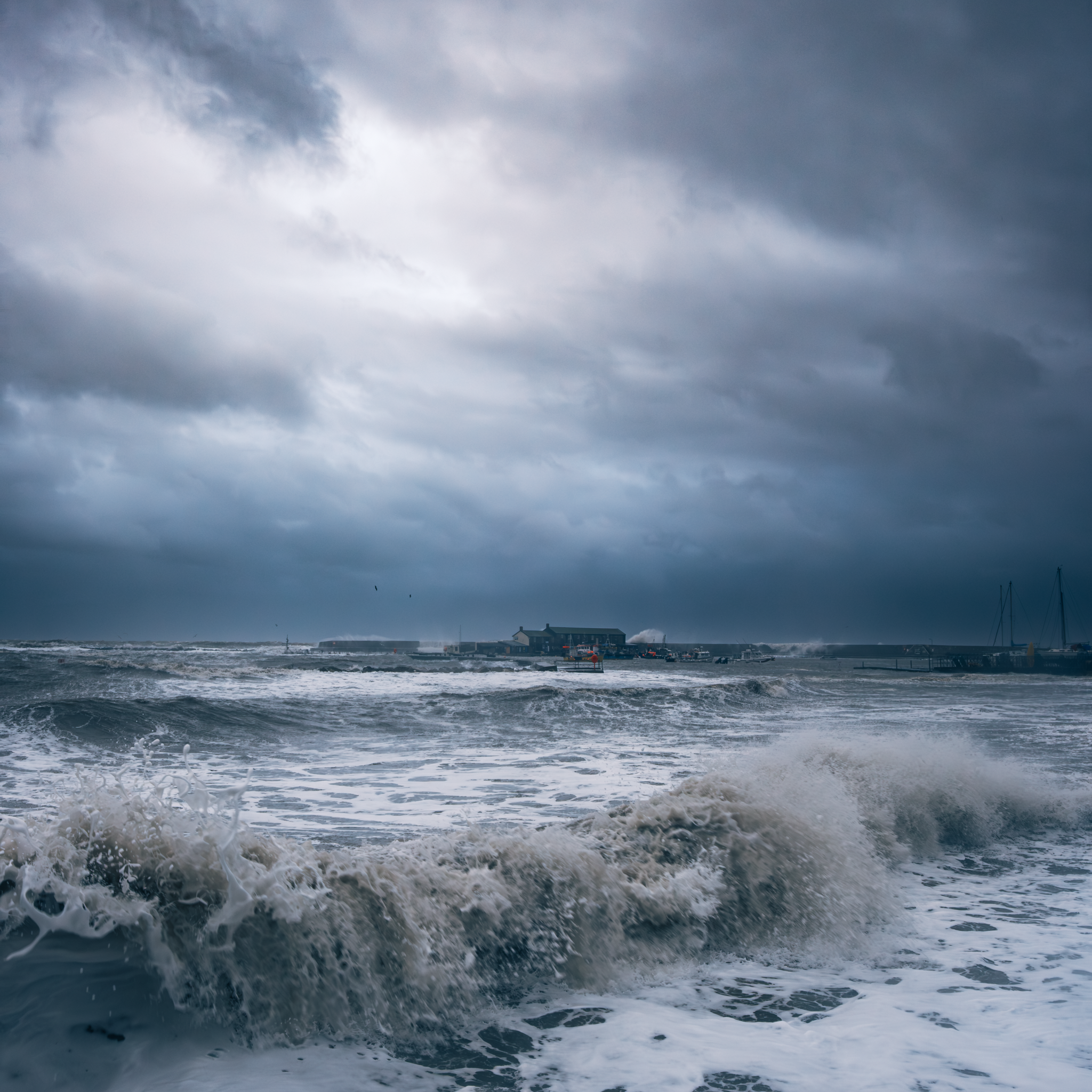
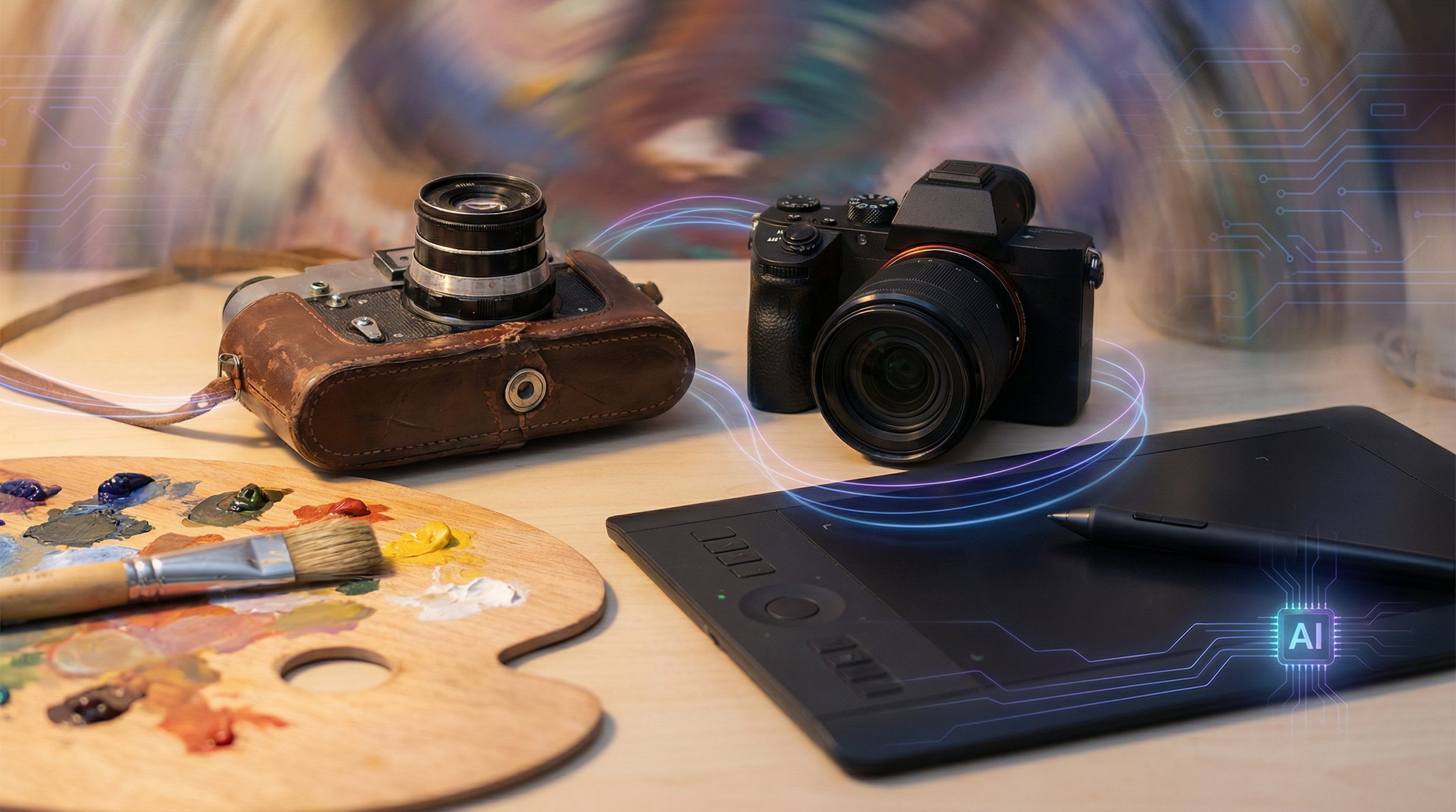
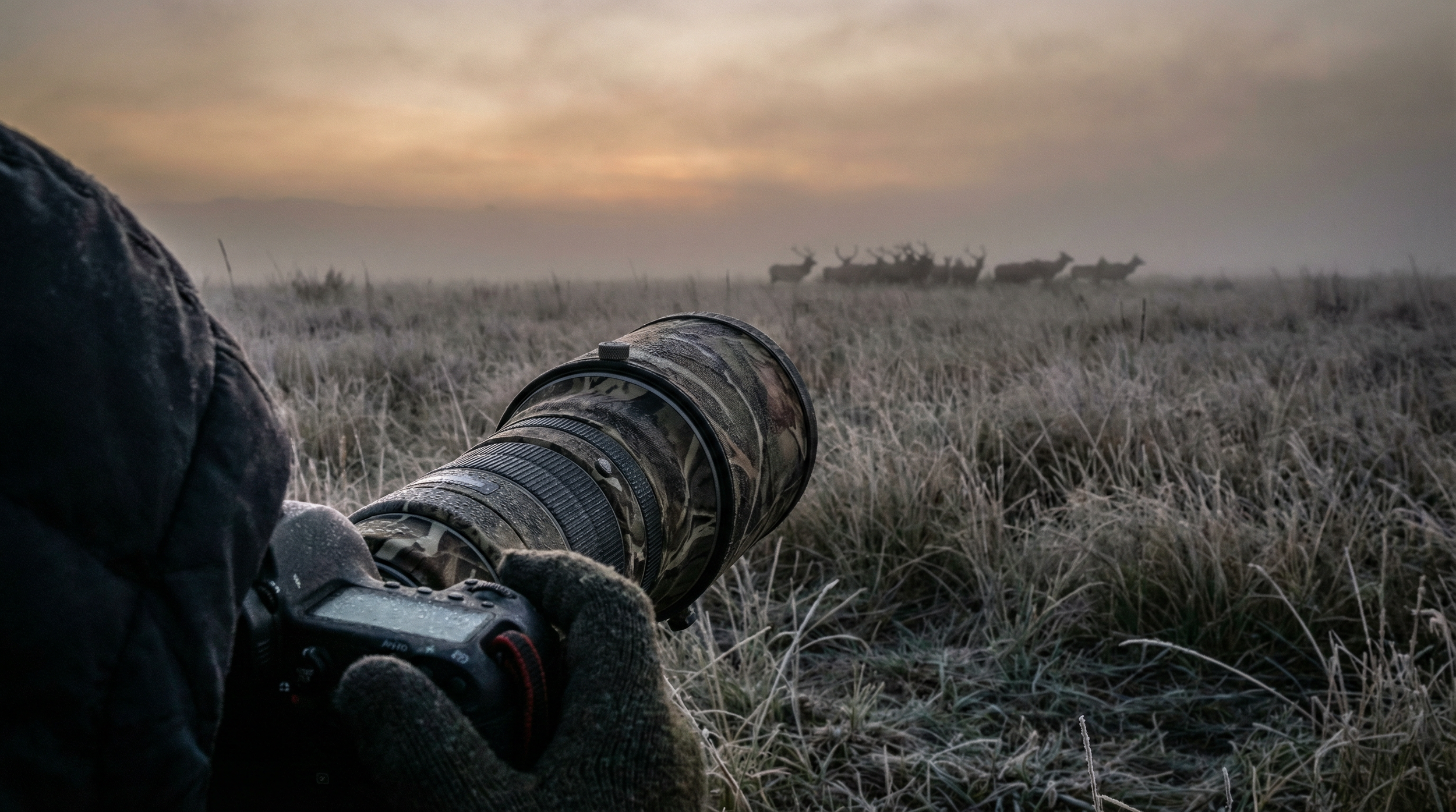
Adobe dropped Photoshop 27.3.0 on the 27th January, and for once it's not just AI hype and features nobody asked for. This update brings some genuinely useful stuff that photographers and editors have been requesting for years.
Camera Raw tools finally join the party
The headline features are 2 (actually 3) new Adjustment Layers: Clarity & Dehaze and Grain.
If you've ever wanted to use Clarity or Dehaze without opening Camera Raw or converting to a Smart Object, your prayers have been answered. They now work exactly like Curves, Levels or any other adjustment layer. You can mask them, adjust opacity, change blend modes, and they stay fully editable in your PSD.
Clarity is brilliant for adding punch to textures and details in your midtones without blowing out highlights or crushing shadows. Dehaze cuts through atmospheric haze (or adds it if you reverse the slider), and having it as an adjustment layer means you can apply it selectively with a mask.
Grain gets the same treatment. Want to add film-style texture to knock the digital edge off a super-clean file? Chuck a Grain adjustment layer on top, dial it in, and you're done. It's particularly good for black and white work or vintage treatments.
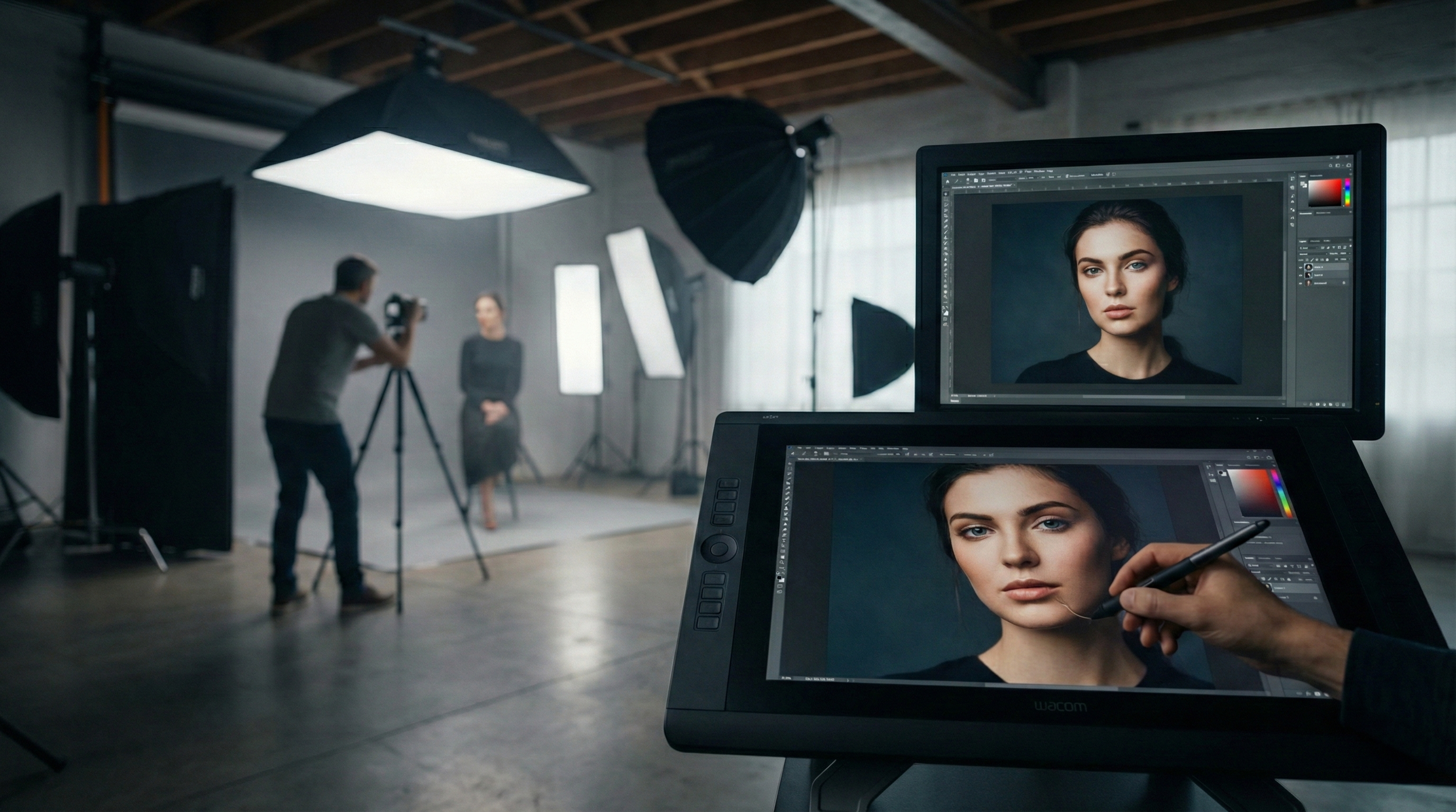
The AI tools are growing up
On the generative side, things have improved quite a bit.
Generative Fill and Generative Expand now output at up to 2K resolution, which means extended canvases and filled areas look far less mushy and hold detail much better. Adobe has also added model selection, so you can pick the Firefly version that best suits what you're doing.
The real game-changer is Reference Image support in Generative Fill. You can now feed Photoshop a reference photo and it'll try to match the lighting, colour and structure when generating new content. This is massive for compositing work or keeping a series of images consistent.
The Remove tool has also been quietly upgraded. It does a much cleaner job removing objects and people, with fewer obvious smears and repetitive patterns. In most cases you'll get a usable result without needing to follow up with Clone Stamp or Healing Brush.
Why this one matters
This isn't a flashy update, but it's the kind that actually changes how you work.
Having Clarity, Dehaze and Grain as proper adjustment layers keeps everything inside Photoshop's layer stack where it belongs. No more jumping between Camera Raw, no more Smart Objects eating up file size, no more destructive edits.
The AI improvements make the generative tools feel less like tech demos and more like something you'd actually use in client work. Higher resolution output and better reference matching mean you can rely on them for real projects, not just Instagram experiments.
If you're on Creative Cloud, the update should already be available. The new adjustment layers live in the standard Adjustments panel alongside everything else. Well worth checking out, especially if you shoot landscapes, architecture or do any kind of composite work.